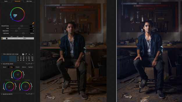
Two big terms when it comes to the post-production specialist known as the Colorist: color correction and color grading. Color correction refers to the balancing and matching of images in a program, basically making things look “correct”. The whites are white, the blacks are black, the exposure isn’t distracting or inappropriate. This is a huge part of the colorist’s job. It’s basically clean-up for things that might have gone less than optimal on shoot day. It’s okay, shooters, we’ve got your back.
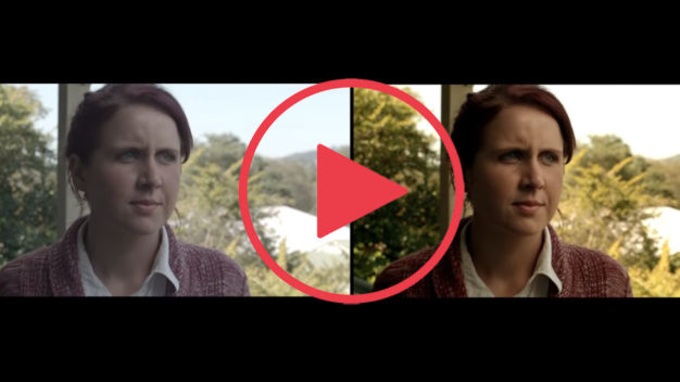
 When a program has gone through the process of color correction, there is now an opportunity for the colorist and director (sometimes also director of photography), to define a look for the program. The flexibility and raw power of modern day color correction tools like DaVinci Resolve, Baselight, and Premiere Pro, have opened the doors to creative adjustments in post. In the old days, colorists (known as color timers) would run through actual film and change the film print as they played through. David Lynch knows a thing or two bout it. More and more these days, the colorist is playing a bigger role in developing the look of programs like we’ve never experienced before. Click the video to check out colorist guru Warren Eagles briefly describing what he might be doing during his work day.

The colorist is the new post-production role you didn’t know you needed. But it’s important to set them up for success. The more information you can give your colorist concerning your footage, the better. Camera settings, color spaces of both recorded footage and destination, a “lookbook” containing samples of images you like in regards to your program, etc, etc. It’s also very important to have your program “picture-locked”, which essentially means the edit will not change, therefore avoiding the risk of rework for the colorist. One important thing to note! Color correction and grading is not a magic wand. If footage is shot poorly, it might not be recoverable. Colorists are sweeteners of an already good image. So remember your director of photography and your production designer when you want a beautiful final product.

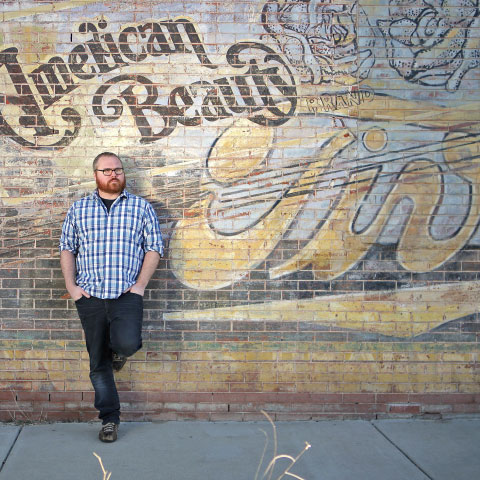
If you have the budget, you might like to have the colorist develop several looks to choose from. There are some classic looks such as the teal and orange color contrast look most strongly used in Michael Bay films or the unique saturation of Jean-Pierre Jeunet’s films. Now both of these examples are very strong and some might argue overbearing. I personally love a bold look where a daring director and colorist attempt to set their program apart. But it must be appropriate. Color affects your audience’s perception of what’s happening, most often subconsciously. So your choices in a color grading session are important to how your program is experienced. Here’s a spot I colored for SunWest Credit Union that went with an earthy textured look. I also really liked the look of this spot for Central Asia Institute with a clean saturated look to really pop the color of the paint. It’s also a fantastic organization, btw.
There’s a lot of choices to make and possible directions to go, but that’s part of the fun! Call us up at One Floor Up and we’ll get your project looking nice and clean. I love Top 10 lists, so here’s one from one of my favorite YouTube content creators Cinefix.

